
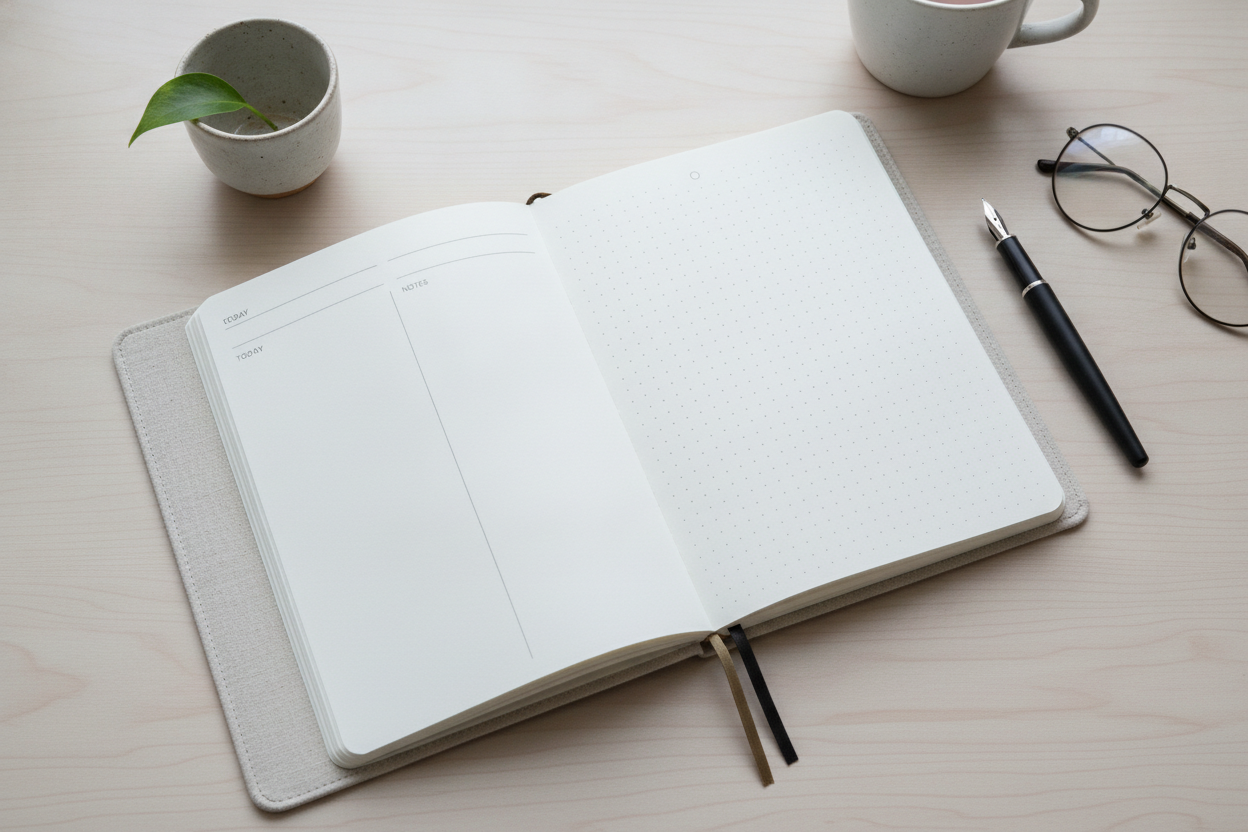
A minimalist journal layout can make a surprisingly big difference in how often you return to write. When the page feels calm and uncluttered, your attention stays on your thoughts instead of the design around them. That is especially helpful for a personal reflection website built around reading and writing rather than visual noise.
Start with the basics: clear typography, generous spacing, and a simple navigation flow. Readers should be able to find recent entries, browse older reflections, and move between pages without effort. A clean layout does not mean a boring one. It means every element has a purpose and nothing distracts from the writing itself.
For journaling, minimal design can also reduce internal pressure. A busy interface can make a private entry feel like a performance, while a simple page feels more like a notebook. That shift encourages honesty and consistency. You do not need decorative elements to make the space meaningful; often, the most effective design choice is to let the words breathe.
If you are building a reflection archive, think about how the layout supports memory. Dates, subtle categories, and clear excerpts can help you revisit past thoughts without overwhelming the page. The best minimalist systems are the ones that disappear while still making the experience easy and intuitive. In that sense, the design becomes a quiet partner in the writing process, supporting the habit instead of competing with it.
Leave a Reply